Home » March Marketing Challenge

Tag: March Marketing Challenge

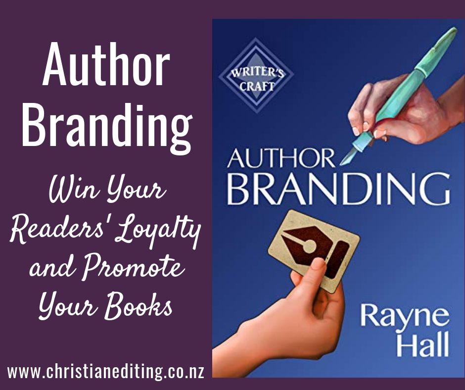
Author Branding: Win Your Readers' Loyalty and Promote Your Books by Rayne Hall

Book Review | Author Branding by Rayne Hall

If you read my post last week, you’ll know that on Monday 4 March 2019 I’ll kick off my annual March Marketing Challenge: Kick-Start Your Author Platform. This is the third year I’ve run the challenge, and it’s been great to see writers take their first steps to building an online platform.

As part of my preparation I’m reviewing and updating the challenge, removing references to Google+ (yay! One less social media network to worry about!), and adding information about GDPR and Gutenberg.

(If you can’t join us on Monday or if you’re reading this post after Monday, don’t worry. The challenge is available throughout the year. The only difference is we won’t all be working through it together. Click here to find out more and sign up.)

I’m also reading a bunch of books about marketing to see what else I can or should add to the Challenge, and I’ll be posting several reviews over the next few weeks.

For this reason, I was thrilled to be asked to beta read Rayne Hall’s newest craft book: Author Branding: Win Your Readers’ Loyalty and Promote Your Books.

Understanding author branding is the beginning of creating your author platform.

Author Branding by @RayneHall is a must-read for authors looking to build an authentic and manageable author platform #AuthorPlatform #BookReview Share on X

I read a lot of writing craft books, and I’m always impressed by Rayne Hall’s way of giving readers a step-by-step approach to an issues, whether it’s writing, editing, or something broader like using Twitter as a writer. Her book on author branding is no different.

Hall explains the importance of consistent author branding, then takes readers through twelve archetypes. These form the basis of her approach to branding—we should each pick one archetype and develop our brand around that. Just as we should pick a target reader, we should pick a single archetype and “be” that person when marketing, whether online or in person.

I found this approach both refreshing and freeing.

Refreshing, because there were enough archetypes that I could “find” myself (unlike other books I’ve read, where I was supposed to choose from five), but not so many that the decision was difficult. And freeing, because it gives us permission to ignore what others are doing.

Once you’ve identified your archetype, Hall takes you though how that might apply in different areas of branding e.g. how we present ourselves online, and what we might choose to share on social media (yes, she states we don’t have to share everything on social media. We get to choose).

Freeing, because Hall points out that we should only share material that’s consistent with our archetype. We don’t have to be everything to everyone. We don’t even have to be everything to our target reader. So I don’t have to share what authors A and B and C are sharing if they’re obviously a different archetype.

Instead, I can focus on sharing what fits my archetype and do that well.

(Which is what I’ve been trying to do, but it’s great to have someone else validate my approach and give a solid rationale for it).

The Kindle version of Author Branding by Rayne Hall is currently on a pre-order sale–just 99 cents (click here to buy).

It’s a bargain and a must-read. It’s also a quick read, so you have time to buy it now, read it over the weekend, and use that new knowledge as you develop your author platform.

And if you don’t have an author platform yet, maybe now is the time to start. Click here to check out the March Marketing Challenge, and I’ll look forward to helping you kick-start your author platform!
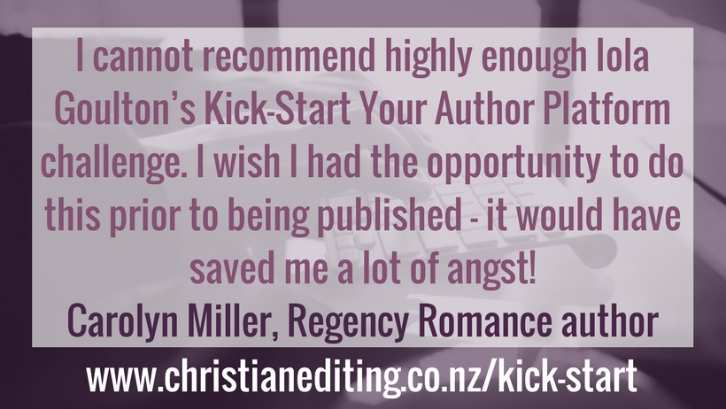
Endorsement from Carolyn Miller

Building Your Author Website

4 Decisions to Make Before Building Your Author Website (An #AuthorToolBoxBlogHop Post)

I’ve been busy building websites. The demise of Google+ has meant we’ve created a new WordPress-based site for Australasian Christian Writers, and I’m now doing the same for International Christian Fiction Writers. And I still need to review my own sites …

I’ve been reminded that building your author website is a lot easier if you make some of the key decisions before you start. This site was the first I built, and it took weeks—simply because there were so many decisions to be made. The most recent site only took two days, because I made all the big decisions before I started (although we still haven’t officially launched the site … and I’m not responsible for the content).

Here are the big four decisions:

1. Decide on your platform

Website design has come a long way from the days when people had to speak html as a second language in order to be able to develop a website. Now there are a variety of free and paid options that mean even the least tech-savvy person can set up a website.

The most well-known options are Blogger and WordPress. Other options include SquareSpace, Weebly, and Wix. All have free and paid options, with the paid options allowing you to use a custom domain name (i.e. www.iolagoulton.com rather than www.christianreads.blogspot.com).

Blogger (powered by Google) is probably the easiest to use, especially if you’re not especially tech-savvy. However, it’s an old platform, needs investment, and it’s unclear how the death of Google+ will affect Blogger commenting going forward (and existing Google+ comments will be lost, along with images stored in Google+).

WordPress.org (the paid version) has a huge range of themes and plugins you can use to customise your site, but most people would need the assistance of a web designer to undertake any customisation. The advantage of using a WordPress-based site is that it’s designed to be a website not just a blog, so the finished product looks a lot more professional.

(If you want help building a WordPress.org site, either click here to sign up for my March Marketing Challenge, or check out Shannon Mattern’s free 5 Day Website Challenge.)

2. Choose a Theme

WordPress has a virtually unlimited number of themes, both free and paid. It might be tempting to use the standard theme (currently Twenty Nineteen), but that’s soon going to date your site … and you run the risk of your site looking exactly the same as all the other sites using the same theme.

I use the free version of the Make theme from Theme Foundry on this site—it’s fully customisable, but not difficult to use (especially not if you sign up for the 5 Day Website Challenge). A lot of people use and love Divi, available from Elegant Themes.

The most important things to look for in a theme are:

Mobile Responsive

More and more people access the internet using mobile and tablet devices, so you need to chose a theme that automatically adapts to the size of the screen.

Customisable

Many themes have a limited number of fonts and colourschemes. That might not matter if you don’t already have your own brand fonts and colours. But if you do, you’ll want a theme you can adapt to your own branding rather than being forced to use the preset colours and fonts.

3. Decide your colourscheme.

The problem with picking a colour is you’re not at school any more. You have more than the standard eight colours of crayon on offer at school (although you might have been one of the lucky kids to have Crayola crayons with 64 colours).

No, now you have an almost unlimited choice (somewhere around 16,700,000, if I’ve calculated correctly).

Colour should reflect your genre: black and red probably aren’t the best choices for a contemporary romance author.

How do you choose? What colours go together?

Don’t worry. Canva.com has some blog posts which will give you some good ideas around possible colour combinations:

4. Pick your fonts.

Fonts are both easier and more difficult to pick than colours. Sure, there are less than 16,700,000 choices, but you have to choose two, or maybe even three.

You need an easy-to-read font for your body text, and another font for your headings (perhaps more than one, as you can have several levels of headings and subheadings). You can be a little more creative with this choice, but it still needs to be consistent with your genre and author brand.

Canva and Elegant Themes have some excellent blog posts on font choices:

It can be tempting to stick with the tried-and-true Arial or Times New Roman fonts, perhaps because it’s hard to decide on a font. But some fonts are best avoided.

As you look through the font lists, you’ll see a lot you don’t like, some you like but which aren’t right for your brand, and (hopefully) a smaller number of appropriate font choices. Then you need to consider which two or three fonts you can use together.

Here are some useful resources on font pairings:

That last resource is very cool. Pick a font, and it doesn’t just tell you what fonts would pair well. It shows you four or five options on a mock website, so you can really see how the fonts look together (hover over the text for it to tell you the font name).

Just set a timer: there are so many options that it’s easy to get lost!

Do you need help in developing your website or your author platform?

If so, check out my March Marketing Challenge: Kick-Start Your Author Platform. It’s a 40-day Challenge, and I take you through every step, from considering your genre and target reader, to a real live website. You’ll receive a 70-page workbook, and membership to our exclusive Facebook group—a great place to ask questions.

Click here to find out more.

This post is part of the monthly Author ToolBox Blog Hop, organised by Raimey Gallant. We now have over 40 blogs participating. To find more Blog Hop posts: